Thursday, 21 October 2010

Evaluation

Final Cover:


This is the final version of my college magazine cover.


I took the picture of my model in front of the orange wall in the Oak building and was originally going to get rid of the background and have a photo of something else (which was undecided), but instead I chose to leave the it as orange represents enthusiasm and excitement; attitudes that are both required to succeed in life.

I chose to have my model hold the folder in a way that allowed me to add anchorage so that i wasn't restrained to simply adding it around him.


I settled on the name 'Wyke Weekly' after considering which of my possible names sounded the best.


I decided to stick to one or two fonts as to create a house style that I could use throughout the magazine if I had to make the whole thing. I chose these particular fonts because, the 'main' font will appeal to teenagers/students as it looks a fairly 'young' font; the sub-font looks handwritten and therefore gives a look of personalisation to the cover.

It is not visible here, but there are actually two images on the cover. One of the wall with my model in front of it and another of the same picture but minus the wall. This was so I could adjust the wall contrast/lighting/etc without messing up the model's contrast/lighting/etc as I thought it already looked good as the picture was taken.

I decided to make the different subheadings slightly different sizes so that the biggest one 'Wyke At Work' catches the reader's attention and then allows them to see the other headings.

I kept some conventional aspects of magazine covers on my cover but not all of them as I felt some were unnecessary. A bar code, for example; I realised I did not need a bar code as the magazine would be free and therefore would not need to be bought. Looking at other magazines, I found that most choose to have their model in front of the masthead, but I chose not to do this as I thought it looked more effective and readable if the model was not in front of it. I did keep the issue number as I thought, if people wanted to keep the magazines, they would easily be able to keep them in order or find the one they wanted simply by looking at what issue number it is. I also kept on the web address so that people can go onto the website to find more information on the college and/or the magazine.

Final Contents:

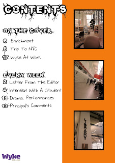
This is the final version of my college magazine contents page.
I chose to stick to the fonts and colour schemes I had used on the cover to keep the house style constant but I added the red splatter and the different fonts on it to stand out and grab people's attention.

I have given information on what is in the magazine that was not mentioned on the cover and reinforced what was on the cover by informing the reader what page everything is on.

The panoramic picture at the bottom was originally 4 different pictures but by using Adobe Photoshop Elements, I made it look like one long shot of all three buildings. I put this picture in because all the other pictures I had used were of the interior and I thought there should be some diversity in what was shown. I also added a green filter over the top of it so that it looked more natural.

I added an orange filter on top of the other three pictures so that they looked warm and inviting. It draws the reader in and makes them feel relaxed.

Programmes/Websites Used

In order to complete my project, I had to use a range of programs and websites.

I used Adobe Photoshop to physically create the magazine. I found this simpler than I had done when I attempted to do my advert on it as I had practiced and therefore improved. While working on my project at home, I used Adobe Photoshop Elements as I do not possess the full version of it.

I used blogger.com to display my work as I progressed through the task.

I used my phone, a Samsung GS5600, to take the photographs as it has a good camera.

I used dafont.com to find the fonts I wanted to use.

I used google images to find the paint splat and Wyke college logo.


Discarded Images


I didn't use this picture because i had another that was similar that I liked more and so used that one instead.
I didn't use this picture because I had another of the library sign that looked better.
I didn't use this picture beacuse the camera is too far away from the model.
I didn't use this picture because the model is not smiling.
I didn't use this picture because the model is not looking at the camera.
I didn't use this picture because i don't like the angle I took it at and the sky is gloomy.
 I didn't use this picture because it is not a picture of anything in particular.
I didn't use this picture because I had other pictures I liked more than this one.
I didn't use this picture because I took a panoramic shot of all of the buildings and so did not need them individually.
I didn't use this picture because I took a panoramic shot of all of the buildings and so did not need them individually. And there were people in the way.
I didn't use this picture because I walk walking when I took it so it came out wavy.
Overall Comments

I am very pleased with the way my cover and contents page turned out as I have never done anything like this before and found it really enjoyable. I also think it looks quite good and I am pleased with the results of my efforts.

Wednesday, 20 October 2010

Analysis Of Existing Magazines


  • The girl's t shirt advertises her college. This is encouraging people to look into the college and perhaps consider attending it.
  • There is a house style which keeps the magazine consistent and therefore looks more effective than if it was all different fonts.
  • There are conventional features to this cover such as a masthead, a barcode, a date, anchorage and the price.
  • The background is blurred which makes the model stand out more. This means that the eyes are drawn straight to her.
  • The colours of the magazine are red, white and blue, which are patriotic, as this is an American magazine.

  • The boy is holding books which encourage learning and commitment to work.
  • He is standing in front of a plain black wall so that the focus is entirely on him.
  • There are conventional features to this cover such as a masthead, a barcode, a date, anchorage and the price.
  • There is a house style which keeps the magazine consistent and therefore looks more effective than if it was all different fonts.
  • The yellow/green writing stands out against the black and therefore makes it more appealing.
  • Pink is used to attract the reader's attention to the splat icon as it is the only other colour from black and yellow/green.
  • On both of these magazines, the model is standing in front of the masthead, which i may incoporate into my cover.

  • This is a simple but effective cover as it emphasises the picture by keeping the background plain.
  • There is not much anchorage which makes the picture stand out even more because there is nothing else to look at.
  • The price 'free' is on the cover but I don't think it is needed because people do not need to be informed of something's price if it doesn't have one. This is why there is no barcode.
  • There are some conventional features on this cover such as a masthead and some anchorage.

Saturday, 16 October 2010

NEW Mock Up Of Cover

I changed my mind about the cover and will probably use this picture instead. I still need to edit the writing as it is hard to read in some places.

After re-reading the brief,  I now realise I cannot use this picture because there are no people in it.

Pictures

These are some pictures I took that I might use in my magazine.


Monday, 11 October 2010

Mock Up Of Cover

This is a mock up of the cover I will use for my magazine. I did not take the picture myself so I wil take a similar picture for my own use.

Tuesday, 5 October 2010

House Style - Font

I will be using 'Infected Font' from dafont.com for the main font throughout the magazine and 'Nothing You Could Say' for the other text.

Monday, 4 October 2010

Planning

Name ideas:

-ScrapBook
-Wyke College Magazine
-Variety
-Wyke Weekly

Picture Ideas:
-Student with books in arms standing infront of the lockers
-Student working in the library
-Student sat on window seat in canteen with books on the table looking out of the window
-Student in front of orange wall in Oak jumping in a star shape